You have a salon website. You paid someone to build it, or you built it yourself on Squarespace at midnight after a long shift. Either way, the phone is not ringing the way it should, and your appointment book has gaps you cannot explain. The problem is almost never your prices or your location. The problem is your salon website design.
Most salon and spa websites look fine at a glance. Nice font, a few photos, a contact page. But looking fine and actually converting visitors into booked clients are two completely different things. I have built and audited hundreds of local business websites. The gap between a site that gets compliments and a site that generates revenue is wider than most owners realize.
Why Most Salon Websites Fail Before Anyone Reads a Word
The first thing a potential client does when they land on your website is make a subconscious judgment. Not about your services. Not about your prices. About whether they trust you enough to keep reading. That judgment happens in under three seconds, and it is based entirely on visual quality and load speed.
A slow website kills you before you get a chance. Google's data shows that 53% of mobile users abandon a site that takes longer than three seconds to load. For a salon, where the majority of your traffic is coming from someone on their phone during a lunch break or sitting in their car, that number is not a statistic. It is lost bookings.
DIY platforms like Wix and Squarespace make it easy to put something up, but they load a significant amount of bloat by default. Unoptimized images, lazy-loaded scripts, template code you never needed. The site looks good in the builder preview and runs slow in the real world.
Beyond speed, the visual hierarchy matters. If someone lands on your homepage and cannot immediately see what you do, where you are, and how to book, they leave. Not because they are impatient. Because you gave them no reason to stay. Your header needs your salon name, your city, and a booking button. That is it. Everything else comes after.
The Online Booking System Is Not Optional Anymore
If your website's version of "booking" is a contact form or a phone number, you are losing clients every single day. People do not want to call. They do not want to wait for a reply to an email. They want to see your availability, pick a time, and confirm it right now, at 10pm, without talking to anyone.
A proper salon online booking system integrated directly into your website changes the conversion math entirely. When someone has to stop and call, a percentage of them will not bother. When the booking lives on your site, that friction disappears. The decision is made and captured before they have a chance to second-guess it.
The platforms that work well for salons are Vagaro, Fresha, Acuity Scheduling, and Square Appointments. Each has different pricing structures and features, but all of them can be embedded into a properly built website so the booking experience feels native rather than bolted on. That distinction matters more than most people think. If your booking button sends someone to a third-party page with a completely different look and feel, trust drops. People notice when they have been handed off somewhere else.
Salons that add online booking see an average of 26% more appointments booked, with a significant portion of those coming outside of business hours. If your site cannot take a booking at midnight, you are leaving money on the table every single night.
At Black Flag Media, integrating a booking system is part of every salon build we do. It is not an add-on. It is a core function of the site, and it gets built and tested like one. You can see how we structure that work on our services page.
Your Service Menu Is Doing More Work Than You Think
The service menu is the most underbuilt page on almost every hair salon website we have ever looked at. Owners treat it like a list. It is not a list. It is a sales page.
A client lands on your services page because they are trying to figure out if you do what they need, whether you are worth the price, and how long it will take. Your menu needs to answer all three of those questions clearly. That means service names that make sense to a non-industry person, brief descriptions that set expectations, accurate pricing, and approximate time.
Vague pricing like "starting from" trains people to assume the worst. If you do not want to post exact prices, at least give a range. "Color services from $85 to $160 depending on length and technique" is honest and useful. "Pricing available upon consultation" is a friction point that sends people to your competitor who was upfront.
Organize services by category. Cuts. Color. Treatments. Extensions. Waxing. Whatever applies to your business. Do not make someone read through fifteen line items to find out if you do highlights. The faster they find what they are looking for, the more likely they are to book it.
Add a direct booking link or button at the end of each service category. Not just at the top of the page. Not just in the header. Right there, after someone has read about balayage and decided they want it, put the button. Reduce the number of clicks between decision and action.
Spa Website Design and the Role of Photography
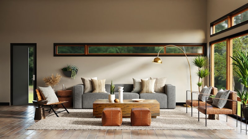
This applies equally to salons, but spa website design lives or dies on photography. People are buying an experience before they ever walk through your door. Your photos either sell that experience or they do not.
Stock photos are a death sentence. Every potential client has seen the same smiling woman in a white robe holding a cucumber. It registers as fake and generic, which is exactly the opposite of what a personal service business needs to communicate. You need photos of your actual space, your actual staff, and ideally your actual clients with their permission.
Hire a photographer for half a day. It is a few hundred dollars and it pays for itself in the first month of improved conversions. Shoot your treatment rooms, your reception area, your products, your team at work. Use those photos on your homepage, your about page, your service pages, and your gallery. Consistency of real imagery across the whole site builds trust in a way nothing else does.
For hair salons specifically, before-and-after photos are some of the highest-converting content you can put on a website. A well-shot transformation photo does more selling than any paragraph of copy. Build a gallery section and keep it updated. If you do good work, let it be visible.
One thing to get right technically: every photo needs to be compressed and properly sized before it goes on the site. A full-resolution image from a professional camera is often 8 to 20 megabytes. That needs to come down to under 200 kilobytes without visible quality loss. This is a technical step that most DIY builders skip, and it is one of the primary reasons salon websites load slowly on mobile.
Mobile Experience Is the Whole Game for Beauty Salon Appointment Booking
Over 70% of local service searches happen on mobile. For beauty salon appointment booking specifically, that number skews even higher because the decision to book is often spontaneous. Someone sees a photo on Instagram, checks your profile, taps the link, and lands on your site. That entire path happens on a phone. If the mobile experience is broken, the booking does not happen.
Mobile-friendly and mobile-optimized are not the same thing. Mobile-friendly means the site technically works on a phone. Mobile-optimized means the site was designed with the phone experience as the primary use case. Buttons are big enough to tap. Text is readable without zooming. The booking button is visible without scrolling. Navigation is simple.
Test your own site right now. Pull it up on your phone. How long did it take to load. Can you read the text without zooming in. Is the booking button visible above the fold. Can you navigate to the services page in two taps or less. If any of those answers are no, you have a mobile problem, and your booking numbers reflect it.
The header on mobile should be stripped down. Your logo, your phone number as a clickable link, and your booking button. That is the priority. Everything else goes in a menu. People are not reading on mobile the way they read on desktop. They are scanning for the action they want to take, and you need to make that action impossible to miss.
How to Get More Salon Appointments Online: The Local SEO Layer
A well-designed site that nobody finds still produces zero bookings. Understanding how to get more salon appointments online requires understanding that your website and your local search presence work together. One without the other is incomplete.
Your Google Business Profile is the first thing most people see when they search for a salon in your area. It needs to be fully built out with accurate hours, photos, your service list, and a direct booking link if the platform supports it. Reviews matter here more than almost anywhere else. A salon with 80 reviews averaging 4.7 stars beats a salon with a better website and 12 reviews almost every time.
On your actual website, local SEO comes down to a few specifics. Your city and neighborhood need to appear naturally in your page titles, your headings, and your body copy. "Hair salon in Austin" is a phrase that should appear on your homepage because that is what people are actually searching. It does not need to be forced or awkward. It just needs to be there.
Your homepage title tag should follow a structure like: "Salon Name | Hair Salon in [City] | Cuts, Color, and Extensions." Your meta description should tell someone what you offer and prompt them to book. These are not optional details. They are the first thing a potential client reads before they even click on your site.
Page speed is also an SEO ranking factor. Google has made this explicit. A slow site ranks lower. So optimizing your images and cleaning up your code is not just a user experience improvement. It directly affects how many people find you in the first place.
If you want to know what your current site is doing well and where it is losing clients, our contact page is the right starting point. We do a straightforward audit, tell you what we find, and give you a clear path forward.
The Best Website Design for Hair Salons and Spas Is Not About Being Pretty
This is the thing I want to leave you with. The best website design for hair salons and spas is not the most beautiful one. It is the one that converts the most visitors into booked clients. Those two things sometimes overlap, but beauty without function is just an expensive brochure.
The fundamentals are not complicated. Fast load time. Clear headline. Visible booking button. Real photography. An honest and organized service menu. A booking system that works on mobile without friction. Local SEO basics in place. That is the whole framework.
What makes it hard is execution. Getting all of those things right at the same time, on every device, without breaking something else in the process, requires someone who knows what they are doing. Most salon owners do not have time to become web developers on top of everything else they are managing. That is not a criticism. It is just reality.
We build sites for salons and spas that are fast, look professional, and are built around one goal: putting more clients in your chair. Our pricing page breaks down what that looks like and what it costs. No surprises, no upsells on things you do not need.
If your appointment book has gaps that your website should be filling, reach out through our contact page. We will look at what you have, tell you honestly what needs to change, and build something that actually works.